


Table of contents
- What is Grid
- Grid Elements
- Properties of Grid
- Grid Container Properties
- Grid Items Properties
- Reference of this Blog
What is Grid
CSS Grid Layout excels at dividing a page into major regions or defining the relationship in terms of size, position, and layer, between parts of a control built from HTML primitives.
CSS Grid Layout (aka “Grid” or “CSS Grid”), is a two-dimensional grid-based layout system that, compared to any web layout system of the past, completely changes the way we design user interfaces. CSS has always been used to layout our web pages, but it’s never done a very good job of it. First, we used tables, then floats, positioning and inline-block, but all of these methods were essentially hacks and left out a lot of important functionality (vertical centering, for instance).
Flexbox is also a very great layout tool, but its one-directional flow has different use cases and they actually work together quite well! Grid is the very first CSS module created specifically to solve the layout problems we’ve all been hacking our way around for as long as we’ve been making websites. The CSS Grid Layout Module offers a grid-based layout system, with rows and columns, making it easier to design web pages without having to use floats and positioning.
Grid Elements
A grid layout consists of a parent element, with one or more child elements. grid layout enables an author to align elements into columns and rows. However, many more layouts are either possible or easier with CSS grid than they were with tables. For example, a grid container's child elements could position themselves so they actually overlap and layer, similar to CSS positioned elements.
Note: See the result of Codepen at 0.25
Example
Properties of Grid
The properties of Grid is divided into 2 types:
- Grid Container
- Grid Items
Now we will discuss different properties of this type:
Grid Container Properties
Display
Defines the element as a grid container and establishes a new grid formatting context for its contents.
Values:
- grid – generates a block-level grid
- inline-grid – generates an inline-level grid
grid-template-columns:
The grid-template-columns property defines the number of columns in your grid layout, and it can define the width of each column.
The value is a space-separated-list, where each value defines the width of the respective column.
If you want your grid layout to contain 4 columns, specify the width of the 4 columns, or "auto" if all columns should have the same width. The grid-template-columns property can also be used to specify the size (width) of the columns.
grid-template-row:
The grid-template-row property defines the number of rows in your grid layout, and it can define the width and height of each row.
The value is a space-separated-list, where each value defines the height of the respective row. This property may be specified as:
- either the keyword value none
- or a value
- or an value.
Example
grid-template-areas
The grid-template-areas CSS property specifies named grid areas, establishing the cells in the grid and assigning them names. Those areas are not associated with any particular grid item, but can be referenced from the grid-placement properties grid-row-start, grid-row-end, grid-column-start, grid-column-end, and their shorthands grid-row, grid-column, and grid-area.
Values:
- < grid-area-name > – the name of a grid area specified with grid-area
- . – a period signifies an empty grid cell
- none – no grid areas are defined
Examples
Another Example of naming grid-area
grid-template
A shorthand for setting grid-template-rows, grid-template-columns, and grid-template-areas in a single declaration.
Values:
- none – sets all three properties to their initial values
- < grid-template-rows > / < grid-template-columns > – sets grid-template-columns and grid-template-rows to the specified values, respectively, and sets grid-template-areas to none
Syntax
/* Keyword value */
grid-template: none;

/* grid-template-rows / grid-template-columns values */
grid-template: 100px 1fr / 50px 1fr;
grid-template: auto 1fr / auto 1fr auto;
grid-template: [linename] 100px / [columnname1] 30% [columnname2] 70%;
grid-template: fit-content(100px) / fit-content(40%);

/* grid-template-areas grid-template-rows / grid-template-column values */
grid-template:
  "a a a"
  "b b b";
grid-template:
  "a a a" 20%
  "b b b" auto;
Example
column-gap/grid-column-gap
The column-gap CSS property sets the size of the gap (gutter) between an element's columns.
Syntax
/* Keyword value */
column-gap: normal;

/* <length> values */
column-gap: 3px;
column-gap: 2.5em;

/* <percentage> value */
column-gap: 3%;

/* Global values */
column-gap: inherit;
column-gap: initial;
column-gap: revert;
column-gap: revert-layer;
column-gap: unset;
row-gap/ grid-row-gap
The row-gap CSS property sets the size of the gap (gutter) between an element's rows.
Syntax
/* <length> values */
row-gap: 20px;
row-gap: 1em;
row-gap: 3vmin;
row-gap: 0.5cm;

/* <percentage> value */
row-gap: 10%;

/* Global values */
row-gap: inherit;
row-gap: initial;
row-gap: revert;
row-gap: revert-layer;
row-gap: unset;
gap or grid-gap
A shorthand for row-gap and column-gap
Values:
< grid-row-gap > < grid-column-gap > – length values
Syntax
.container {
  /* standard */
  gap: <grid-row-gap> <grid-column-gap>;

  /* old */
  grid-gap: <grid-row-gap> <grid-column-gap>;
}
If no row-gap is specified, it’s set to the same value as column-gap
Note: The grid- prefix is deprecated (but who knows, may never actually be removed from browsers). Essentially grid-gap renamed to gap. The unprefixed property is already supported in Chrome 68+, Safari 11.2 Release 50+, and Opera 54+.
Example of gap, row-gap and column-gap
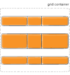
justify-items
Aligns grid items along the inline (row) axis (as opposed to align-items which aligns along the block (column) axis). This value applies to all grid items inside the container.
Values:
- start – aligns items to be flush with the start edge of their cell
- end – aligns items to be flush with the end edge of their cell
- center – aligns items in the center of their cell
- stretch – fills the whole width of the cell (this is the default)
Syntax
.container {
  justify-items: start | end | center | stretch;
}
Figure of justify-items :start

Figure of justify-items :end

Figure of justify-items :center

Figure of justify-items :stretch

Examples
align-items
Aligns grid items along the block (column) axis (as opposed to justify-items which aligns along the inline (row) axis). This value applies to all grid items inside the container.
Values:
- stretch – fills the whole height of the cell (this is the default)
- start – aligns items to be flush with the start edge of their cell
- end – aligns items to be flush with the end edge of their cell
- center – aligns items in the center of their cell
- baseline – align items along text baseline. There are modifiers to baseline — first baseline and last baseline which will use the baseline from the first or last line in the case of multi-line text.
Syntax
.container {
  align-items: start | end | center | stretch;
}
Figure of align-items :start

Figure of align-items :end

Figure of align-items :center

Figure of align-items :stretch

Example
place-items
place-items sets both the align-items and justify-items properties in a single declaration.
Values:
/ – The first value sets align-items, the second value justify-items. If the second value is omitted, the first value is assigned to both properties. For more details, see align-items and justify-items.
This can be very useful for super quick multi-directional centering:
Syntax
.center {
  display: grid;
  place-items: center;
}
Example
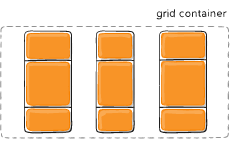
justify-content
Sometimes the total size of your grid might be less than the size of its grid container. This could happen if all of your grid items are sized with non-flexible units like px. In this case you can set the alignment of the grid within the grid container. This property aligns the grid along the inline (row) axis (as opposed to align-content which aligns the grid along the block (column) axis).
Values:
- start – aligns the grid to be flush with the start edge of the grid container
- end – aligns the grid to be flush with the end edge of the grid container
- center – aligns the grid in the center of the grid container
- stretch – resizes the grid items to allow the grid to fill the full width of the grid container
- space-around – places an even amount of space between each grid item, with half-sized spaces on the far ends
- space-between – places an even amount of space between each grid item, with no space at the far ends
- space-evenly – places an even amount of space between each grid item, including the far ends
Syntax
.container {
  justify-content: start | end | center | stretch | space-around | space-between | space-evenly;
}
Figure of justify-content :start
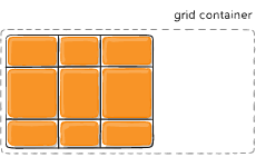
Figure of justify-content :end
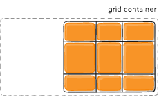
Figure of justify-content :center
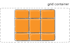
Figure of justify-content :stretch
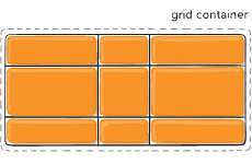
Figure of justify-content :space-around
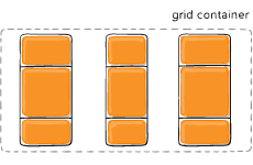
Figure of justify-content :space-between
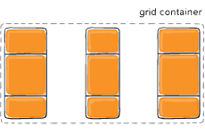
Figure of justify-content :space-evenly
Example
align-content
This align-content work in column direction same like justify content.....justify content work in row-axis and align-content work in column axis.
Values:
- start – aligns the grid to be flush with the start edge of the grid container
- end – aligns the grid to be flush with the end edge of the grid container
- center – aligns the grid in the center of the grid container
- stretch – resizes the grid items to allow the grid to fill the full height of the grid container
- space-around – places an even amount of space between each grid item, with half-sized spaces on the far ends
- space-between – places an even amount of space between each grid item, with no space at the far ends
- space-evenly – places an even amount of space between each grid item, including the far ends
Syntax
.container {
  align-content: start | end | center | stretch | space-around | space-between | space-evenly;
}
Figure of align-content :start
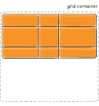
Figure of align-content :end
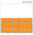
Figure of align-content :center
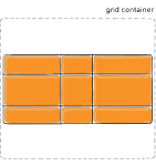
Figure of align-content :stretch
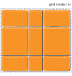
Figure of align-content :space-around
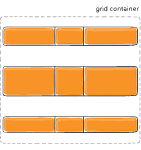
Figure of align-content :space-between
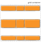
Figure of align-content :space-evenly
Example
place-content
place-content sets both the align-content and justify-content properties in a single declaration.
Values:
/ – The first value sets align-content, the second value justify-content. If the second value is omitted, the first value is assigned to both properties. For more details, see align-content and justify-content.
This can be very useful for super quick multi-directional centering:
Syntax
.center {
  display: grid;
  place-content: center end;
}
Example
Grid-auto-row and Grid-auto-column
The grid-auto-rows property sets a size for the rows in a grid container.
This property affects only rows with the size not set.
Syntax
grid-auto-rows: auto| max-content| min-content| length;
The grid-auto-columns property sets a size for the columns in a grid container.
This property affects only columns with the size not set.
Syntax
grid-auto-column: auto| max-content| min-content| length;
.container {
  grid-template-columns: 60px 60px;
  grid-template-rows: 90px 90px;
}
grid-auto-flow
The grid-auto-flow CSS property controls how the auto-placement algorithm works, specifying exactly how auto-placed items get flowed into the grid.
This property may take one of two forms:
- a single keyword: one of row, column, or dense.
- two keywords: row dense or column dense.
Syntax
#grid {
   display: grid;

  grid-auto-flow: column; /* or 'row', 'row dense', 'column dense' */
}
Example
Consider this HTML file
<section class="container">
  <div class="item-a">item-a</div>
  <div class="item-b">item-b</div>
  <div class="item-c">item-c</div>
  <div class="item-d">item-d</div>
  <div class="item-e">item-e</div>
</section>
You define a grid with five columns and two rows, and set grid-auto-flow to row (which is also the default):
CSS File
.container {
  display: grid;
  grid-template-columns: 60px 60px 60px 60px 60px;
  grid-template-rows: 30px 30px;
  grid-auto-flow: row;

.item-a {
  grid-column: 1;
  grid-row: 1 / 3;
}
.item-e {
  grid-column: 5;
  grid-row: 1 / 3;
}
}
When placing the items on the grid, you only specify spots for two of them ecause we set grid-auto-flow to row, our grid will look like this. Notice how the three items we didn’t place (item-b, item-c and item-d) flow across the available rows:
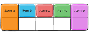
Example of grid-auto ---- column, row and flow
grid
A shorthand for setting all of the following properties in a single declaration: grid-template-rows, grid-template-columns, grid-template-areas, grid-auto-rows, grid-auto-columns, and grid-auto-flow (Note: You can only specify the explicit or the implicit grid properties in a single grid declaration).
Values:
- none – sets all sub-properties to their initial values.
- – works the same as the grid-template shorthand.
- / [ auto-flow && dense? ] ? – sets grid-template-rows to the specified value. If the auto-flow keyword is to the right of the slash, it sets grid-auto-flow to column. If the dense keyword is specified additionally, the auto-placement algorithm uses a “dense” packing algorithm. If grid-auto-columns is omitted, it is set to auto.
- [ auto-flow && dense? ] ? / – sets grid-template-columns to the specified value. If the auto-flow keyword is to the left of the slash, it sets grid-auto-flow to row. If the dense keyword is specified additionally, the auto-placement algorithm uses a “dense” packing algorithm. If grid-auto-rows is omitted, it is set to auto.
Syntax
/* <'grid-template'> values */
grid: none;
grid: "a" 100px "b" 1fr;
grid: [linename1] "a" 100px [linename2];
grid: "a" 200px "b" min-content;
grid: "a" minmax(100px, max-content) "b" 20%;
grid: 100px / 200px;
grid: minmax(400px, min-content) / repeat(auto-fill, 50px);

/* <'grid-template-rows'> /
   [ auto-flow && dense? ] <'grid-auto-columns'>? values */
grid: 200px / auto-flow;
grid: 30% / auto-flow dense;
grid: repeat(3, [line1 line2 line3] 200px) / auto-flow 300px;
grid: [line1] minmax(20em, max-content) / auto-flow dense 40%;

/* [ auto-flow && dense? ] <'grid-auto-rows'>? /
   <'grid-template-columns'> values */
grid: auto-flow / 200px;
grid: auto-flow dense / 30%;
grid: auto-flow 300px / repeat(3, [line1 line2 line3] 200px);
grid: auto-flow dense 40% / [line1] minmax(20em, max-content);

/* Global values */
grid: inherit;
grid: initial;
grid: revert;
grid: revert-layer;
grid: unset;
Example
Grid Items Properties
grid-column-start
The grid-column-start CSS property specifies a grid item's start position within the grid column by contributing a line, a span, or nothing (automatic) to its grid placement. This start position defines the block-start edge of the grid area. Values:
- – can be a number to refer to a numbered grid line, or a name to refer to a named grid line
- span – the item will span across the provided number of grid tracks
- span – the item will span across until it hits the next line with the provided name
- auto – indicates auto-placement, an automatic span, or a default span of one
Syntax
.item {
  grid-column-start: <number> | <name> | span <number> | span <name> | auto;

}
grid-column-end
The grid-column-end CSS property specifies a grid item's end position within the grid column by contributing a line, a span, or nothing (automatic) to its grid placement, thereby specifying the block-end edge of its grid area.
area. Values:
- – can be a number to refer to a numbered grid line, or a name to refer to a named grid line
- span – the item will span across the provided number of grid tracks
- span – the item will span across until it hits the next line with the provided name
- auto – indicates auto-placement, an automatic span, or a default span of one
Syntax
.item {

  grid-column-end: <number> | <name> | span <number> | span <name> | auto;

}
grid-row-start
The grid-row-start CSS property specifies a grid item's start position within the grid row by contributing a line, a span, or nothing (automatic) to its grid placement, thereby specifying the inline-start edge of its grid area area. Values:
- – can be a number to refer to a numbered grid line, or a name to refer to a named grid line
- span – the item will span across the provided number of grid tracks
- span – the item will span across until it hits the next line with the provided name
- auto – indicates auto-placement, an automatic span, or a default span of one
Syntax
.item {

  grid-row-start: <number> | <name> | span <number> | span <name> | auto;

}
grid-row-end
The grid-row-end CSS property specifies a grid item's end position within the grid row by contributing a line, a span, or nothing (automatic) to its grid placement, thereby specifying the inline-end edge of its grid area.
area. Values:
- – can be a number to refer to a numbered grid line, or a name to refer to a named grid line
- span – the item will span across the provided number of grid tracks
- span – the item will span across until it hits the next line with the provided name
- auto – indicates auto-placement, an automatic span, or a default span of one
Syntax
.item {

  grid-row-end: <number> | <name> | span <number> | span <name> | auto;
}
Example
.item-a {
  grid-column-start: 2;
  grid-column-end: five;
  grid-row-start: row1-start;
  grid-row-end: 3;
}
Example
grid-row
grid-column
The grid-row CSS shorthand property specifies a grid item's size and location within a grid row by contributing a line, a span, or nothing (automatic) to its grid placement, thereby specifying the inline-start and inline-end edge of its grid area.
The grid-column CSS shorthand property specifies a grid item's size and location within a grid column by contributing a line, a span, or nothing (automatic) to its grid placement, thereby specifying the inline-start and inline-end edge of its grid area.
Shorthand for grid-column-start + grid-column-end, and grid-row-start + grid-row-end, respectively.
Values:
- < start-line > / < end-line > – each one accepts all the same values as the longhand version, including span
Syntax
.item {
  grid-column: <start-line> / <end-line> | <start-line> / span <value>;
  grid-row: <start-line> / <end-line> | <start-line> / span <value>;
}
                                    or

.item-c {
  grid-column: 3 / span 2;
  grid-row: third-line / 4;
}
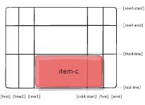
Example
grid area
The grid-area CSS shorthand property specifies a grid item's size and location within a grid by contributing a line, a span, or nothing (automatic) to its grid placement, thereby specifying the edges of its grid area.
Gives an item a name so that it can be referenced by a template created with the grid-template-areas property. Alternatively, this property can be used as an even shorter shorthand for grid-row-start + grid-column-start + grid-row-end + grid-column-end.
Values:
- – a name of your choosing
- / / / – can be numbers or named lines
Syntax
.item {
grid-area: <name> | <row-start> / <column-start> / <row-end> / <column-end>;
}
or
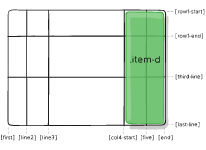
.item-d {
grid-area: header;
}
As the short-shorthand for grid-row-start + grid-column-start + grid-row-end + grid-column-end:
.item-d {
  grid-area: 1 / col4-start / last-line / 6;
}
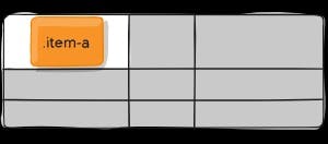
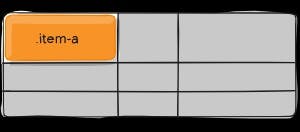
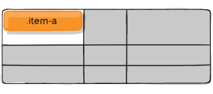
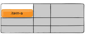
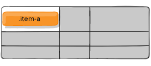
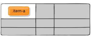
justify-self
Aligns a grid item inside a cell along the inline (row) axis (as opposed to align-self which aligns along the block (column) axis). This value applies to a grid item inside a single cell.
Values:
- start – aligns the grid item to be flush with the start edge of the cell
- end – aligns the grid item to be flush with the end edge of the cell
- center – aligns the grid item in the center of the cell
- stretch – fills the whole width of the cell (this is the default)
Syntax
.item {
  justify-self: start | end | center | stretch;
}
Example
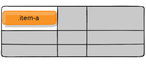
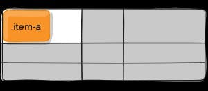
.item-a {
  justify-self: start;
}
.item-a {
  justify-self: end;
}
.item-a {
  justify-self: center;
}
.item-a {
  justify-self: stretch;
}
justify-self-start
justify-self-end
justify-self-center
justify-self-stretch
align-self
Aligns a grid item inside a cell along the block (column) axis (as opposed to justify-self which aligns along the inline (row) axis). This value applies to the content inside a single grid item.
Values:
- start – aligns the grid item to be flush with the start edge of the cell
- end – aligns the grid item to be flush with the end edge of the cell
- center – aligns the grid item in the center of the cell
- stretch – fills the whole height of the cell (this is the default)
Syntax
.item {
  align-self: start | end | center | stretch;
}
Example
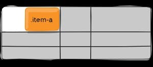
.item-a {
  align-self: start;
}
.item-a {
  align-self: end;
}
.item-a {
  align-self: center;
}
.item-a {
  align-self: stretch;
}
place-self
place-self sets both the align-self and justify-self properties in a single declaration.
Values:
- auto – The “default” alignment for the layout mode.
- / – The first value sets align-self, the second value justify-self. If the second value is omitted, the first value is assigned to both properties.
Examples:
.item-a {
  place-self: center;
}
.item-a {
  place-self: center stretch;
}