
What is Flexbox
The Flexbox is a flexible box model in CSS which give us flexible layouts, Generally Flexbox is a one dimensional layout model which has flexible layouts with distributes space to control it's alignment and use it efficiently. it is a layout model that provides an easy and clean way to arrange items within a container. Flexbox can be useful for creating small-scales layouts & is responsive and mobile-friendly. The main idea behind the flex layout is to give the container the ability to alter its items’ width/height (in order) to best fill the available space (mostly to accommodate to all kind of display devices and screen sizes). A flex container expands items to fill available free space or shrinks them to prevent overflow.
Features of Flexbox
- It is very flexible
- It is used for small layouts
- It give proper spacing between boxes
- It arrange the proper alignment.
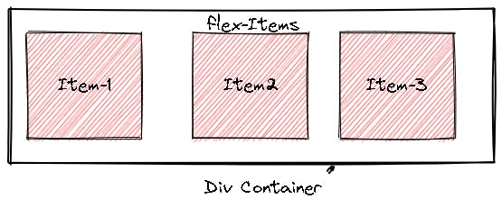
Generally flexbox is divided into two parts i.e. Flex Container & Flex Items
Terminology in Flexbox
Flex-Container:
The Parent div which contain various flex items/division is called Flex Container
Flex-Container:
The items/divisions in a Container i is called Flex Items.
Flex-Axes
Items will be laid out following either the main axis (from main-start to main-end) or the cross axis (from cross-start to cross-end).
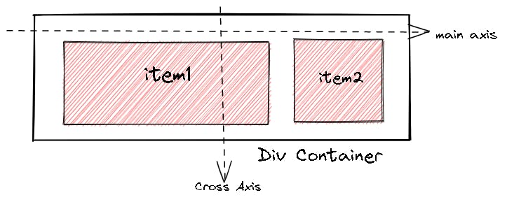
In the flexbox, there are lot of components divided in it, With the two axis i.e. main axis and cross axis there are some parts that we will stude. Let's learn from it's figure
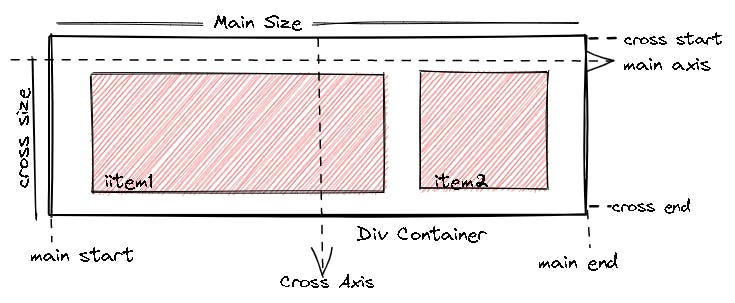
Main-Axis
- Bydefault the main axis work form left to right.
- Main Start: The start of the main axis is called Main Start.
- Main Size: The length between Main Start and Main End is called Main Size.
- Main End: The endpoint is called Main End.
Cross Axis
- The cross axis will be perpendicular to the main axis.
- By default, Cross Axis runs perpendicular to the Main Axis i.e. from top to bottom.
- Cross Start: The start of the Cross axis is called Cross Start.
- Cross Size: The length between Cross Start and Cross End is called Cross Size.
- Cross End: The endpoint is called Cross End.
Flexbox Properties
Flexbox property is the shorthand property for flex-shrink, flex-grow and flex-basis.The flex property sets the flexible length on flexible items. If the element is not a flexible item, the flex property has no effect.
The Flexbox Properties is divided into to Categories:
- Flexbox Container Properties.
- Flexbox Items Properties.
Flexbox Container Properties.
- display
- flex-direction
- flex-wrap
- Justify-content
- flex-flow
- align-items
- align-content
- gap, row-gap, column-gap

display
This defines a flex container; inline or block depending on the given value. It enables a flex context for all its direct children.
 // inline-flex
 .container {
   display: flex;
 }
Example:
### Flex-direction The flex-direction CSS property sets how flex items are placed in the flex container defining the main axis and the direction (normal or reversed)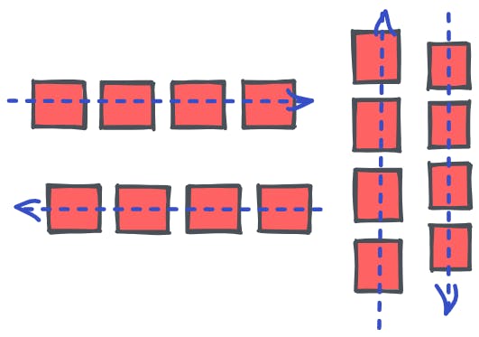 Flex-direction is divided into four types:
- row (default): left to right in ltr; right to left in rtl
- row-reverse: right to left in ltr; left to right in rtl
- column: same as row but top to bottom
- column-reverse: same as row-reverse but bottom to top
#### Example:

Flex-wrap
The flex-wrap CSS property sets whether flex items are forced onto one line or can wrap onto multiple lines. If wrapping is allowed, it sets the direction that lines are stacked.
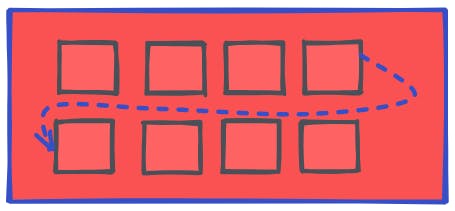
Flex-wrap is divided into three types: nowrap: flex item by default will be wrap in one line. wrap: flex item will wrap in multiple lines from top to bottom. wrap-reverse: flex item will wrap in multiple line from bottom to top.
Example:
justify-content
This defines the alignment along the main axis. It helps distribute extra free space leftover when either all the flex items on a line are inflexible, or are flexible but have reached their maximum size. It also exerts some control over the alignment of items when they overflow the line. justify-content is divided into following type types:
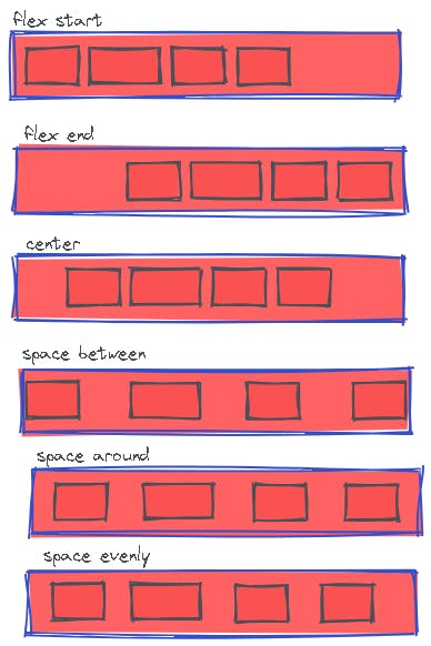
/* Positional alignment */
justify-content: center;     /* Pack items around the center */
justify-content: start;      /* Pack items from the start */
justify-content: end;        /* Pack items from the end */
justify-content: flex-start; /* Pack flex items from the start */
justify-content: flex-end;   /* Pack flex items from the end */
justify-content: left;       /* Pack items from the left */
justify-content: right;      /* Pack items from the right */

/* Baseline alignment */
/* justify-content does not take baseline values */

/* Normal alignment */
justify-content: normal;

/* Distributed alignment */
justify-content: space-between; /* Distribute items evenly
                                   The first item is flush with the start,
                                   the last is flush with the end */
justify-content: space-around;  /* Distribute items evenly
                                   Items have a half-size space
                                   on either end */
justify-content: space-evenly;  /* Distribute items evenly
                                   Items have equal space around them */
justify-content: stretch;       /* Distribute items evenly
                                   Stretch 'auto'-sized items to fit
                                   the container */
Example:
Flex-flow
This is a shorthand for the flex-direction and flex-wrap properties, which together define the flex container’s main and cross axes. The default value is row nowrap.
//Syntax
.container {
   flex-flow: column wrap;
 }
Example:
Align-item
This defines the default behavior for how flex items are laid out along the cross axis on the current line. Think of it as the justify-content version for the cross-axis (perpendicular to the main-axis). The align-items are of following type:
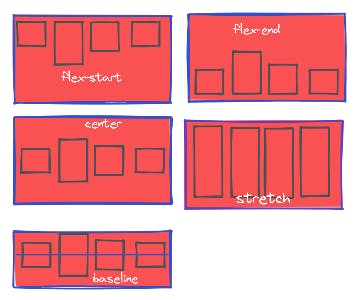
- stretch (default): stretch to fill the container (still respect min-width/max-width).
- flex-start / start / self-start: items are placed at the start of the cross axis. The difference between these is subtle, and is about respecting the flex-direction rules or the writing-mode rules.
- flex-end / end / self-end: items are placed at the end of the cross axis. The difference again is subtle and is about respecting flex-direction rules vs. writing-mode rules.
- center: items are centered in the cross-axis.
- baseline: items are aligned such as their baselines align.
- The safe and unsafe modifier keywords can be used in conjunction with all the rest of these keywords (although note browser support), and deal with helping you prevent aligning elements such that the content becomes inaccessible.
Example:
Align-Content
The CSS align-content property sets the distribution of space between and around content items along a flexbox's cross-axis or a grid's block axis.
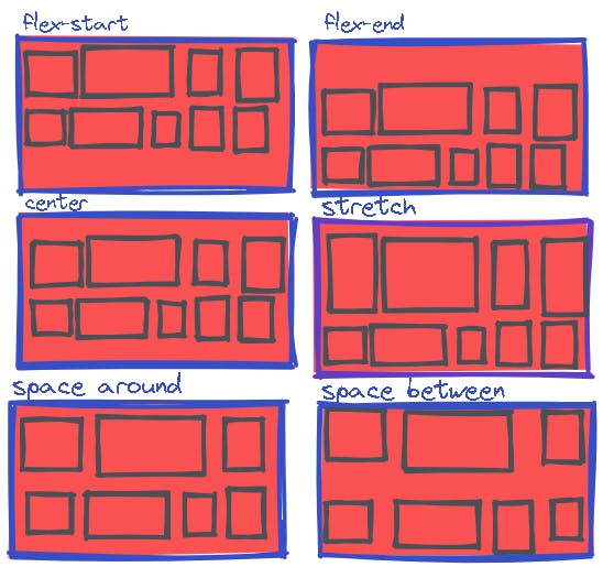
- stretch Default value:. Lines stretch to take up the remaining space
- center:Lines are packed toward the center of the flex container
- flex-start: Lines are packed toward the start of the flex container
- flex-end: Lines are packed toward the end of the flex container
- space-between: Lines are evenly distributed in the flex container
- space-around: Lines are evenly distributed in the flex container, with half-size spaces on either end
- space-evenly: Lines are evenly distributed in the flex container, with equal space around them
Example:
gap, row-gap, column-gap
The gap CSS property sets the gaps (gutters) between rows and columns. It is a shorthand for row-gap and column-gap. The gap property explicitly controls the space between flex items. It applies that spacing only between items not on the outer edges. It is not exclusively for flexbox, gap works in grid and multi-column layout as well.
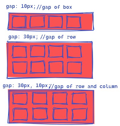
//Syntax
.container {
  display: flex;
  gap: 10px;
  gap: 10px 20px; /* row-gap column gap */
  row-gap: 10px;
  column-gap: 20px;
}
Example:

Flexbox Items Properties.
- order
- flex-grow
- flex-shrink
- flex-basis
- flex
- align-self
Order
The order property specifies the order of a flexible item relative to the rest of the flexible items inside the same container. The order CSS property sets the order to lay out an item in a flex or grid container. Items in a container are sorted by ascending order value and then by their source code order. Items with the same order revert to source order. Note: If the element is not a flexible item, the order property has no effect.
//Syntax
order =
  <integer>
flex-grow
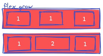
The flex-grow property specifies how much the item will grow relative to the rest of the flexible items inside the same container. The main size is either width or height of the item which is dependent on the flex-direction value.
The remaining space is the size of the flex container minus the size of all flex items' sizes together. If all sibling items have the same flex grow factor, then all items will receive the same share of remaining space, otherwise it is distributed according to the ratio defined by the different flex grow factors.
flex-grow is used alongside the other flex properties flex-shrink and flex-basis, and normally defined using the flex shorthand to ensure all values are set. Note: If the element is not a flexible item, the flex-grow property has no effect.
//Syntax
flex-grow =
  <number[0, ∞]>
Example:
flex-shrink
The flex-shrink property specifies how the item will shrink relative to the rest of the flexible items inside the same container.
Note: If the element is not a flexible item, the flex-shrink property has no effect.
The flex-shrink CSS property sets the flex shrink factor of a flex item. If the size of all flex items is larger than the flex container, items shrink to fit according to flex-shrink.
In use, flex-shrink is used alongside the other flex properties flex-grow and flex-basis, and normally defined using the flex shorthand.
//Syntax
flex-shrink =
  <number [0,∞]>
Example:

flex-basis
The flex-basis CSS property sets the initial main size of a flex item. It sets the size of the content box unless otherwise set with box-sizing.
//Syntax
flex-basis: max-content;
flex-basis: 100px;
flex-basis: min-content;
flex-basis: fit-content;
flex-basis: content;
Example:
flex
The flex CSS shorthand property sets how a flex item will grow or shrink to fit the space available in its flex container.The flex property is a shorthand property for:
flex-grow flex-shrink flex-basis The flex property sets the flexible length on flexible items.
//Syntax
/* Keyword values */
flex: auto;
flex: initial;
flex: none;

/* One value, unitless number: flex-grow
flex-basis is then equal to 0. */
flex: 2;

/* One value, width/height: flex-basis */
flex: 10em;
flex: 30%;
flex: min-content;

/* Two values: flex-grow | flex-basis */
flex: 1 30px;

/* Two values: flex-grow | flex-shrink */
flex: 2 2;

/* Three values: flex-grow | flex-shrink | flex-basis */
flex: 2 2 10%;
Example:
self-align
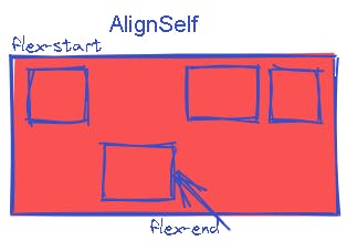
The align-self property specifies the alignment for the selected item inside the flexible container. The align-self CSS property overrides a grid or flex item's align-items value. In Grid, it aligns the item inside the grid area. In Flexbox, it aligns the item on the cross axis. Note that float, clear and vertical-align have no effect on a flex item.
//Syntax
.item {
  align-self: auto | flex-start | flex-end | center | baseline | stretch;
}
Example:
Thanks for Reading the blog.

Reference of the Blog Information
- w3schools.com/css/default.asp
- developer.mozilla.org/en-US/docs/Web/CSS
- css-tricks.com/snippets/css/a-guide-to-flex..

